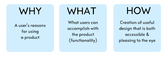
User Experience (UX) design is the process by which gives product a meaningful and relevant experience to the users. This includes features of trademark, aesthetic, usability, and functionality. The phrases "User Experience Design" and "User Interface Design" are frequently interchanged. UX design encompasses a wide range of other topics. There are 3 key parts that every UX designing expert needs to be concerned about. Those are 'Why', 'What', and 'How' of a product use. In order to come up with a meaningful, seamless, and fluid user experience, the designer can start with the Why, then the What, and ultimately the How.
1. Identify the Core User Experience and Designing for Different Screens
Each software product has a core user experience or intended primary task to perform. It is why that product is existing. People use a particular application or tool to solve a problem. Hence, the main task of that application should be meaningful and valuable. Most importantly it should support the user to perform the core task on every channel.
Example: Uber Eats
'Uber Eats is a popular food ordering application. The core task of this application is to handle the ordering of a selected food item to the location provided by the user. So this feature should work well on each device regardless of the screen size. It is quite impossible to develop an application targeting an individual device. But, you can develop the application defining a particular device group based on the core task or main service of the product that the user is likely to focus on.
 |
| Most people access 'Uber Eats' application via mobile devices rather than using it's web version. Therefore, this application should be easily accessible via mobile phone and perform the tasks. |
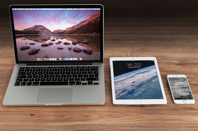
Different device groups provide different services in different contexts and users engage in different interaction modes depending on the type of screen they are looking at. So, to provide a great UX, it is essential to consider various device types.
People use mobile devices mostly to perform micro-tasks such as ordering food, ordering a ride, accessing social media, etc. And tablets are primarily used for content consumption. Meanwhile, laptops are used to perform complex tasks. Understanding this basic context assumption for the various device types is essential to building extraordinary UX.
2. Adapt the Experience for Each Context of Use
After identifying the core UX of the product, the developer should choose a set of device groups that would like to support. Keep in mind that all features do not make sense on all devices. Developers need to identify different scenarios in which the product will be used across the groups of devices and design an experience suitable for each of those scenarios.
Moreover, the common mistake designers do when developing an application for devices with touch screen input such as mobile phones or smartwatch is small tap targets. Tap targets must be adequately sized. There should be a minimum of 7mm tap target. However, if you can use a 10mm tap target size, then it will be greatly affected to enhance the UX of your application.
Another mistake is placing icons or items too closely. There should be enough spacing as it helps to separate the controls and gives the UI a breathing room. The suggested spacing to prevent input errors is a minimum of 23pt.
3. Start with Designing for Smallest Screens
Designers usually begin with large screens and move down to the small screens. Only after completing the design for desktop screens, it ported to mobile and other device groups. But experts say it's better to start designing for the smallest screens first (mobile-first approach) as it forces the designer to include or decide on items or features that matter most to the user. Afterward, you can move to the large screens (tablets, laptops, TV) with a careful selection of the features or items. This way, you can provide a better UX for your application rather than stuffing your product with unnecessary features that won't be really useful to the users.
4. Don’t Ignore the Large Screens
You may like to read: Top 05 Most Demanding Programming Languages
5. Provide Users a Consistent Experience
6. Create a Streamlined Effect
Users must have a consistent experience across different device groups. People easily switch between devices to get things done, and they expect their products and services to change along with them. Users no longer have to consider the device they're using, changes in the surroundings, or changes in context, and can rely on exceptional functionality and ease of use regardless of the device. You may want to make sure that the content consumption on each device is in sync.
Example: The same playlist user creates on the iPhone, will appear on Mac right away.
7. Test the Design
Testing a product is very important before releasing it. You can conduct a usability test with real users on different devices to get their feedback. And try to fix the UX issues accordingly before releasing the product.
You may like to read:10 Surprising SEO Secrets To Boost Your Web Traffic



.png)

